“The pen is mightier than the sword,” as the saying goes. Choosing fonts for preschoolers might seem simple, but it’s actually crucial and directly impacts their learning and visual development. So, how do you select fonts that are both appealing and easy to read, offering the best support for young learners? Join me, a preschool teacher with over 12 years of experience, to discover the answer!
Top Font Choices for Preschoolers
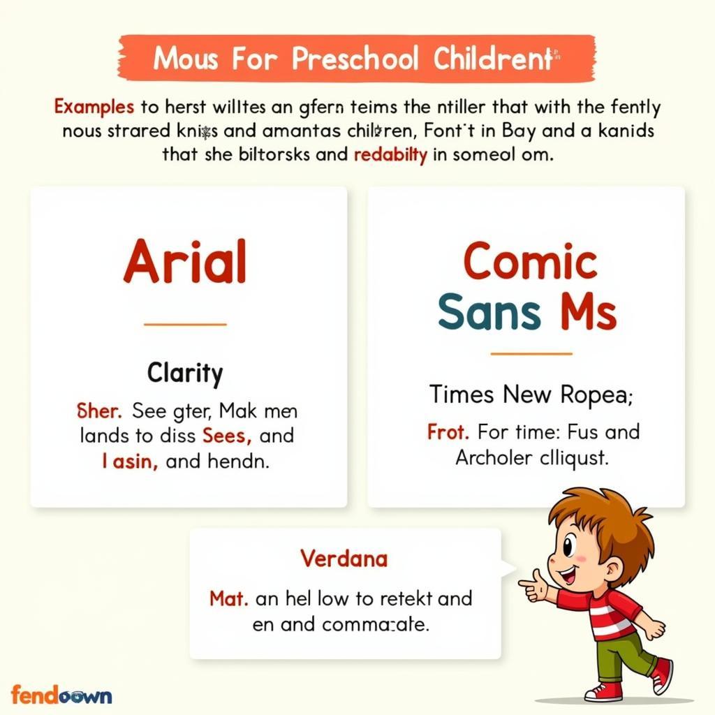
While many fonts are visually appealing, not all are suitable for preschoolers. At this stage, children’s eyes are still developing and can easily tire if they look at text for too long. Therefore, we should prioritize fonts that are simple, clear, and easy to distinguish. Some recommended fonts include Arial, Comic Sans MS, Times New Roman, and Verdana. Ms. Nguyen Thi Lan, a leading expert in early childhood education, also emphasizes the importance of choosing age-appropriate fonts in her book “Secrets to Raising Preschoolers.”
 Choosing the right font for preschool
The Importance of Font Choice in Preschool Education
Selecting the right font not only helps children read and write more easily but also positively influences their knowledge absorption and love for learning. Imagine if children had to look at distorted, incomprehensible letters – would they still be interested in learning? Certainly not! Friendly fonts make children feel comfortable and more confident when learning. According to traditional beliefs, “studying and taking exams” is a significant matter that requires careful preparation in even the smallest details, including font selection.
Choosing Fonts Based on Age Group
Not all preschoolers are the same. For children just beginning to learn letters and numbers, choose large, clear fonts with fewer curves, like Comic Sans MS. For older children who are already familiar with letters, you can use other fonts such as Arial or Times New Roman. Ms. Pham Thi Hoa, principal of Hoa Sen Preschool in Hanoi, shares: “Font selection needs to be flexible and appropriate for each child’s age and level.” This is like “shaping the tree while it’s still young,” helping children develop comprehensively from their first steps.
 Font choices by age for preschoolers
Where to Download Preschool Fonts?
Currently, many websites offer free fonts, and you can easily download preschool fonts to your computer. However, choose reputable sources to ensure quality and safety for your computer. Some reputable websites you can refer to include Google Fonts.
Standard Preschool Fonts: Key Considerations
When choosing standard preschool fonts, in addition to considering style and size, pay attention to the font’s boldness. Fonts that are too bold or too light can make it difficult for children to read. Mr. Tran Van Duc, in his book “Effective Preschool Teaching Methods,” advises using fonts with moderate boldness, making it easy for children to read without eye strain.
font chữ giáo án mầm non also needs to be carefully selected to create visually appealing, easy-to-read lesson plans that capture children’s attention.
In conclusion, choosing fonts for preschoolers, though seemingly small, is of great significance. Take the time to explore and select the best fonts for your little ones, helping them have a smooth and effective start to their learning journey. Leave a comment and share this article if you find it helpful! Visit the “TUỔI THƠ” website to discover more beneficial articles about preschool education. Contact us at 0372999999 or visit us at 234 Hao Nam, Hanoi. We have a 24/7 customer service team.